Welcome! Thank You for Visiting!!
I am Thomas, this is my GitHub Page
(tmb321.github.io)

I am originally from Wyoming. I am currently an undergraduate studying at Lehigh Univeristy in Pennsylvania
For more about me check out My LinkedIn Page
Right now this page is for my Data Storytelling Projects
A Project on Creating Charts from Data of Personal Interest
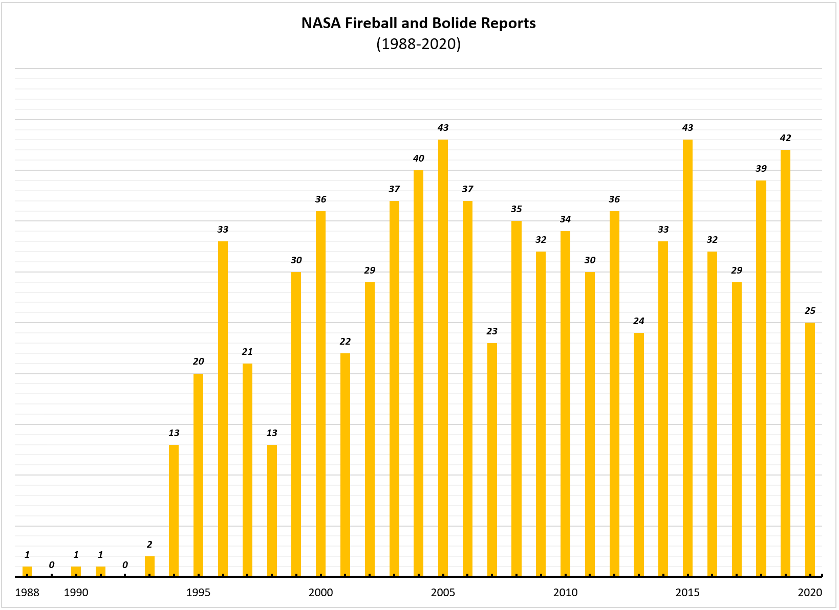
Creating Bar Graph from the NASA Fireball and Bolide Reports on Datastro
A Helpful YouTube Video for Moving Images to your GitHub Page
Explorations of Parse Hub’s Ability to Pick Data
The Racial Profiling Search Results
All 667 Records on Racial Profiling are Organized into Downloadable Excel Workbook
Organization of the Fields: Title, URL, Publication Date, and the Media Type (out of nine possible)
With three sheets: One organized by Date of Publication: the Second by The Nine Media Types in Assenting Order: the Third is For You to Sort However You Would (right click the field heading and communicate your preference for viewing the data)
If a search result interests you and/or you would like to explore the different Media Types, Click on the URL of that record, you will be able to copy it.
RacialProfiling_Assignment_ParaseHub_Results_All667.xlsx
Here I used ZenHub, a New Issue, dragged and droped the file into the Issue, waited for ZenHub to convert the input, copied the output and pasted it just above to create this downloadable link (right above this explination)
For more freedom with the data, you may download the sheet a second way.
Use the First Icon on the right side of the bottom dark gray bar^^
For A Help Video on the Method Used to Embed the Sheet Please Click Here
A Project to Explore Google Virtual Tour
Take a Dive into the Vitality of Water:
The Visible Impact of Natural or Irraged Water Introduction for Vegitation Growth
To See my Drone’s Perpective in Better Detail: Click the Gray Icosahedron (I believe) in the top Left of the Frame To View This Tour in Full Screen on Poly.Google or click HERE
Audio Files
Site 5 & Site 3
The Green River & The High Country Wind
USGS DATA For Green River’s Volumtric Flow Rates and Gage Height
You Can Either Use Controls Built Into The PDF Frames
Or For Examples of Short Cuts:
Ctrl + Scroll = Zoom
Normal Scroll = Up and Down
Shift + Scroll = Left and Right
PreReqs: [Hover Your Mouse of the Frame]
Calculations with Links to Source Information
Wyoming Ecoregion Map and Legend With Evident Borders
The Location of the virual tour is in 18c Pinedale in the Mid-West Part of the State
Same Map: Additional Details on the Right (Look for 18c in the Second Salmon Pink Box “Wyoming Basin”)
Summary Table: Characteristics of the Ecoregions of Wyoming
For 18c Ctrl + Scroll into the Larger Salmon Pink Box “Wyoming Basin”
Cloud Chart
Use the Rotate Clockwise Circlar Arrow in the Top Right Drop Down of this Frame to Properly View this PDF
OR For Some More Short Cuts
Ctrl + ] = Clockwise Rotation
Ctrl + [ = Counter-Clockwise Rotation
PreReqs: [You will have to click on this one before using short cuts]
In The Tour: I reference the Cumulus Clouds (Low Clouds) In Green
Twitter Data Set
#Space: Twitter Data in the Over 7 Days: August 10-17, 2020
Embeded OneDrive Frame
Here is a Static Map of The Locations of Each of these Tweets that used #Space

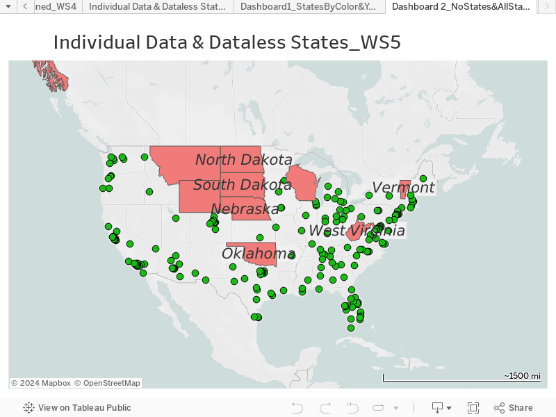
Twitter Data Interative Map: Via Tableau Desktop

Pop Up Window Link for the First Dashboard